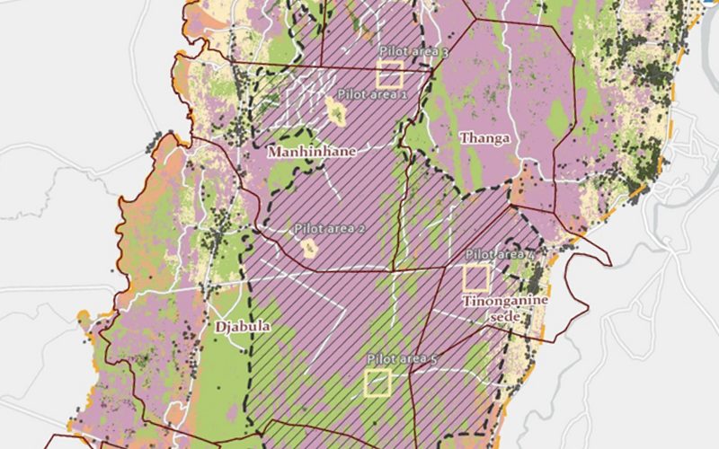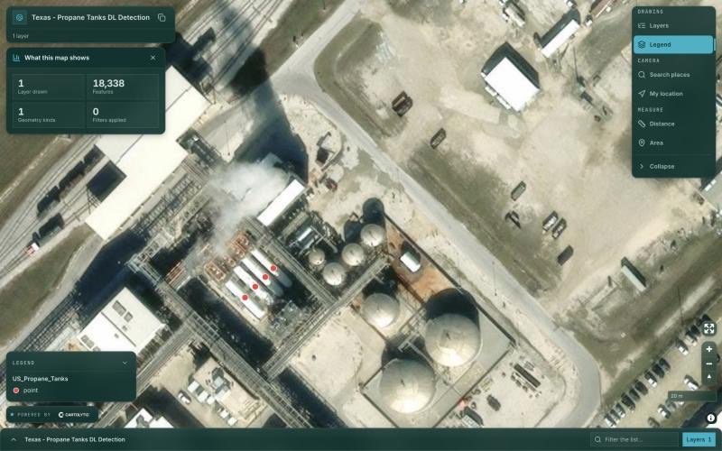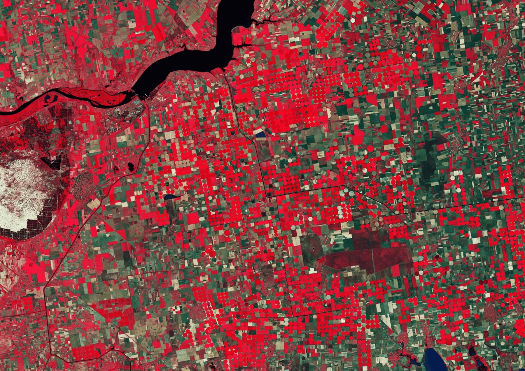


The standard geospatial deliverable is a PDF. The analyst runs the model, exports a few map figures, writes the interpretation, and hands over a polished document. It looks authoritative. It is also, from the moment it is exported, out of date and closed to inspection — a single frame extracted from an analysis that was never one-dimensional.
At Cartolytic we argue something deliberately unfashionable in a consulting market that sells reports: the format is part of the value. The same analysis delivered as an interactive web map is a fundamentally better decision tool than the same analysis delivered as a document. This post makes that case, sketches the technology behind it, and explains how we publish analysis outputs as living maps rather than dead files.
What a static report actually freezes
A PDF does not just fix the pixels. It fixes every judgement call the analyst made on the way to those pixels — which criteria were weighted highest, which classification breaks were chosen, which basemap and zoom level framed the story, which region filled the page. Those choices are usually reasonable. But a real decision needs to interrogate them, and a document cannot be interrogated. When a stakeholder asks "what does this look like if we down-weight slope?" or "where does my specific parcel fall?", the honest answer with a PDF is: commission a revision and wait.
The consequences compound in the room where the decision is made:
- No exploration. The reader sees the analyst's chosen view, not their own question. Nuance that lives between the printed figures is simply invisible.
- No self-service. Every follow-up — a different threshold, a different area, a specific address — becomes a support ticket and a delay.
- Stale on arrival. The moment new imagery, a new sale, or a new sensor reading lands, the document is wrong, and no one can tell by looking at it.
- Weak provenance. A flat figure hides its own evidence. You cannot click a feature to see where a value came from.
What interactivity adds
An interactive web map is the same analysis, but the reader holds the controls. That shift produces five concrete advantages.
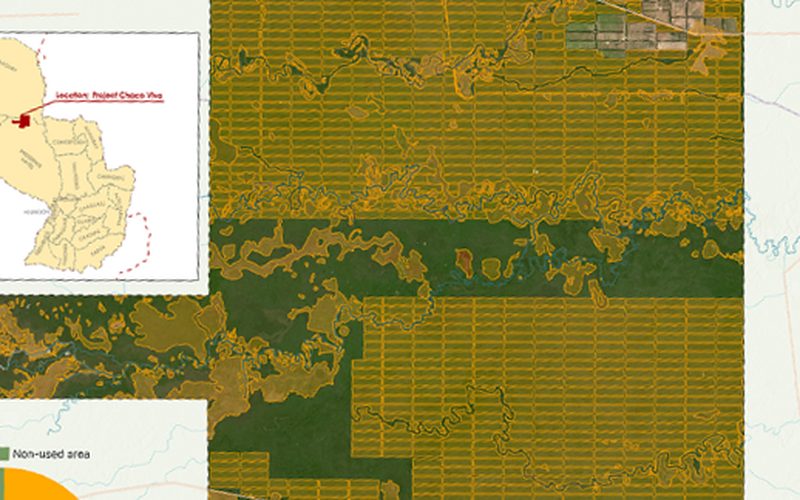
- Exploration. Toggle layers on and off, compare scenarios, adjust what is visible. The decision-maker follows their own line of reasoning through the evidence instead of the analyst's.
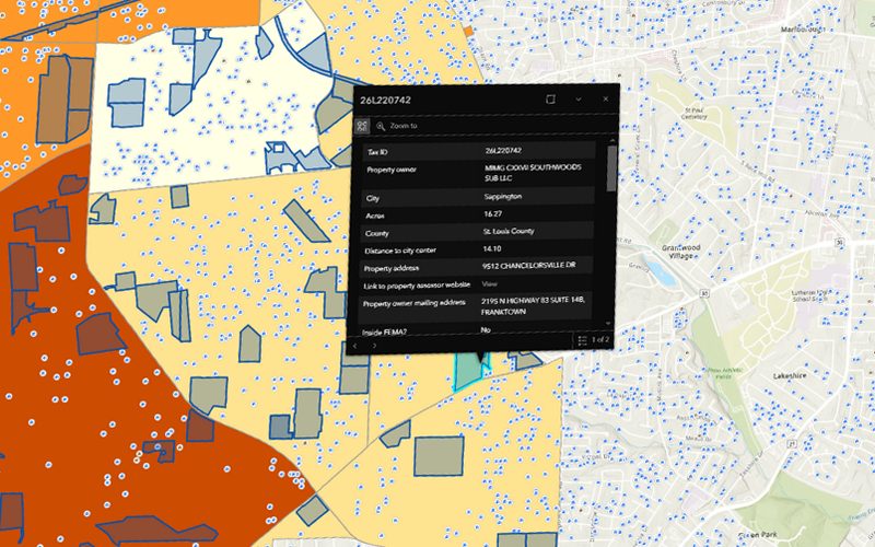
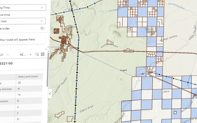
- Self-service. Filter to a region, search for an address, click a feature to read its full attribute record. The questions that used to trigger a revision get answered in seconds by the user.
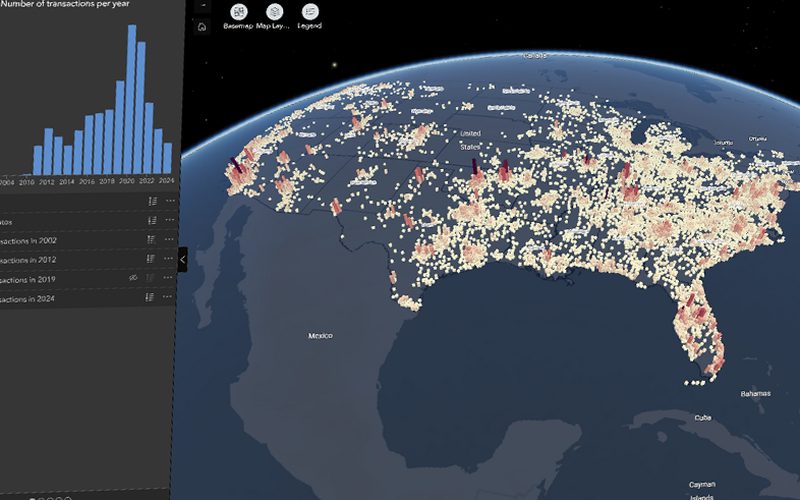
- Always-current data. A map wired to a live data source reflects the latest state. Monitoring dashboards redraw as new satellite imagery arrives; a market map updates as new locations open.
- A shareable link. Distribution is a URL, not an email attachment. Everyone sees one canonical, versioned source of truth instead of forwarding a document that forks into stale copies.
- Stakeholder buy-in. This is the underrated one. An investment committee, a planning board, or a client trusts a conclusion far more when it can interrogate the evidence live. Letting people check their own site and watch the answer hold up is the most persuasive thing an analysis can do. A map that survives poking is believed; a PDF is merely received.
The technology, sketched
Delivering this well is an engineering discipline, not a rendering trick. The moving parts are mature and worth understanding at a high level:
- Vector and raster tiles. Large datasets are cut into small tiles served on demand, so a browser loads only what is in view at the current zoom. This is what lets a national dataset feel instant on a laptop.
- Web-mapping libraries. The client renders and handles interaction — pan, zoom, click, filter, style.
- Hosting and data services. Tiles, styles, and the underlying data need somewhere to live, with access control, versioning, and a link that keeps working.
None of this should be the client's problem. Standing up a tile server, a styling pipeline, authentication, and a durable URL is exactly the undifferentiated heavy lifting that stops good analysis from being published as anything other than a PDF.
Tools
- Leaflet
- MapLibre GL
- Mapbox GL
- Vector and raster tile services
Where this changes the deliverable
Almost every analysis we run is stronger as a living map than as a document. A few concrete cases:
- Suitability results. Instead of a single ranked map, the client explores the scoring, checks candidate sites, and sees why each ranks where it does — the natural home for solar farm site selection and any multi-criteria decision analysis.
- Risk dashboards. A flood and climate risk map lets an asset owner locate their own facilities against hazard layers rather than reading a summary table about someone else's.
- Market maps. Trade areas, catchment, and demographics become explorable, so commercial teams can test their own locations — see our work on trade area and drive-time analysis.
- Monitoring dashboards. Change detection and land cover classification outputs update as new imagery lands, turning a one-off report into an ongoing watch.
The interactive proof
Because this argument is about a deliverable, the honest way to make it is to show it. The interactive tools embedded across our other posts — a suitability explorer you can re-weight, a risk map you can search by address, a monitoring view that redraws with new imagery — are not illustrations of the analysis. They are the analysis, delivered the way we deliver it. Each one is a small live example of what "handed over as a web map" means, and together they form a working portfolio. Cartolytic builds these as the standard output, not an upsell.
Data sources
This is the product story, so the input is the output of any analysis in our catalogue — the web map is the hosting and delivery layer that sits on top.
Open & public
- Not applicable — an interactive web map consumes the results of any underlying analysis rather than a fixed dataset of its own.
Commercial
- Cartolytic provides the hosting, tiling, and delivery layer; this page is itself the demonstration of it.
From dead document to living map
The industry norm is an analyst handing over a PDF. That is the norm we are built to replace. The analysis matters, but so does whether the people who must act on it can explore it, trust it, and return to it as the world changes. If you have an analysis worth publishing — or a decision that deserves better than a static figure — talk to us about delivering it as a living map. Not sure where a project starts, what is feasible, or what the data will support? Our note on scoping a GIS project is the place to begin.