

Finding land for a utility-scale solar farm is not a search for the single best hectare. It is a filtering problem: take an entire region, remove everything that is technically impossible, legally excluded or economically hopeless, and then rank whatever survives. The land that clears every hurdle is usually a small fraction of the map, and the difference between a viable project and a stranded one often comes down to a single factor developers underestimate early on — how far the site sits from a transmission line with spare capacity.
GIS is the natural tool for this because every input is spatial and every constraint is a layer. Solar site selection is a textbook application of multi-criteria decision analysis: standardise many competing factors onto a common scale, weight them by importance, and combine them into a single suitability surface you can defend to investors and permitting authorities.
The factors that actually decide a solar site
Utility-scale siting is driven by a handful of dominant factors. Each one is measurable from spatial data, and each one can quietly kill a project on its own.
- The solar resource. Global horizontal irradiance (GHI) governs energy yield for conventional photovoltaic plants; direct normal irradiance (DNI) matters for concentrating solar systems. This is the revenue engine — small differences in long-term irradiance compound across a 25-to-30-year asset life.
- Terrain. Low, uniform slope keeps civil works and racking costs down and simplifies construction. Aspect matters too: an equator-facing slope (south-facing in the northern hemisphere, north-facing in the southern) captures more sun and reduces inter-row shading.
- Land cover and land use. Forest, wetlands and prime farmland are typically avoided — for permitting, ecological and social reasons — unless the project is explicitly designed for agrivoltaics, where panels and agriculture share the same ground.
- Grid proximity and spare capacity. Distance to a suitable transmission line or substation, and whether that node has room to accept new generation, drives interconnection cost more than almost any other variable. A superb parcel far from the grid loses to a merely good parcel next to a substation.
The workflow, step by step
The analysis follows a consistent sequence: model the terrain, mask out the impossible, score the rest, then measure access.
- Terrain modelling. From a digital elevation model we derive slope and aspect. The same DEM can feed a solar-radiation model that accounts for topographic shading across the year, so valleys and hillsides that lose winter sun are penalised rather than treated as flat, uniform ground.
- Hard exclusions. Some areas are simply off-limits and are applied as a binary mask: protected areas, floodplains, urban footprint, water bodies, airport glint zones and slopes above a buildable threshold. Everything inside the mask is removed before any scoring happens.
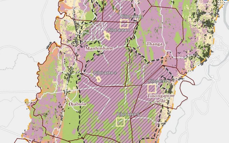
- Standardise, weight, combine. The remaining continuous factors — irradiance, slope, aspect, land-cover preference — are rescaled onto a common suitability scale, weighted according to project priorities, and combined into a single suitability surface across the whole study area.
- Access and grid distance. Buffer and network analysis quantify how far each candidate sits from roads and from suitable grid infrastructure. This is where an attractive suitability score meets economic reality: a site's interconnection distance often reorders the shortlist entirely.
What you get out of it
The point of the exercise is not a pretty raster; it is a set of decisions a developer can act on and sequence. The core deliverables are:
- A suitability map of the region, showing where solar development is favourable, marginal or excluded.
- A ranked shortlist of candidate sites, so limited due-diligence budget goes to the best prospects first.
- An interconnection-distance table that pairs each shortlisted site with its distance to grid, letting a developer sequence which projects to pursue first based on likely connection cost.
This is closely related to the parcel-level filtering we describe for real-estate developers — the same screening backbone, retuned for energy criteria instead of development metrics. The MCDA method below is the same one we apply to combined substation-and-solar suitability work: standardise the competing factors, weight them, combine them into one surface, then test the result against grid access before anything reaches a shortlist.
An interactive screener beats a static PDF
Weights are where solar siting gets political. A developer who prioritises land cost will weight grid distance and terrain differently from one who prioritises schedule certainty or long-term yield. A single static suitability map bakes one set of assumptions into an image and hides the trade-offs.
The better deliverable is an interactive solar-suitability screener: irradiance, slope, grid distance and exclusions combined live, with candidate sites recolouring as the developer shifts priorities between, say, resource quality and interconnection cost. It is essentially the real-estate screener retuned for energy — a tool where stakeholders explore scenarios themselves rather than requesting a new map for every question. Cartolytic builds exactly these kinds of tools, and we make the case for why they outperform static reports when a decision has more than one owner.
Data sources
The quality of a suitability analysis is bounded by its inputs. Open data is more than good enough for regional screening and shortlisting; commercial data earns its cost at the bankability stage, when a single site moves toward financial close.
Open and public
- Global Solar Atlas (World Bank) — GHI and DNI.
- PVGIS — irradiance and PV yield for Europe and globally.
- NREL NSRDB — solar radiation data for the US.
- Copernicus DEM / SRTM — terrain elevation.
- ESA WorldCover — land cover.
- OpenStreetMap + OpenInfraMap — roads and mapped grid infrastructure.
- WDPA — protected areas.
Commercial
- Solargis — bankable irradiance time-series and typical meteorological year (TMY) data.
- Vaisala — solar resource data.
- Airbus WorldDEM / AW3D — high-resolution terrain.
- Hitachi Energy Velocity Suite / S&P Global — grid and interconnection data.
- Regrid — parcel boundaries and ownership.
Where projects go wrong — and how to scope them
The most common failure in solar siting is scoping the analysis around resource quality alone and discovering interconnection constraints only after money has been spent on options and surveys. Grid capacity, protected-area boundaries and land ownership belong in the first pass, not the last. A tightly scoped suitability study front-loads exactly these constraints so the shortlist is realistic from day one. If you are planning this kind of assessment, our note on scoping a GIS suitability project covers how to define criteria, weights and exclusions before the analysis starts. Solar is the first entry in a broader renewable-energy siting cluster — wind, with its very different terrain and wake-effect criteria, follows the same MCDA logic and is the natural next step.